The Challenge
Visual artists face a frustrating compromise online: traditional social media algorithms compress high-fidelity artwork, while generic website builders degrade user experience with slow load speeds and rigid layouts. For JKISINAMAL, the challenge was showcasing a heavy collection of high-resolution visual art across varied aspect ratios without sacrificing mobile performance, inducing layout shifts, or distracting from the artwork’s native aesthetic.
The Solution
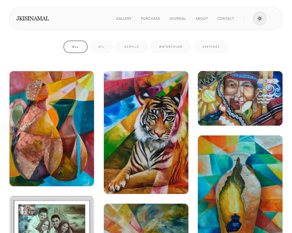
I built an artwork-first, custom digital art gallery that prioritizes visual fidelity and immediate performance. By implementing a dynamic, responsive masonry grid layout with fluid glassmorphic UI accents, the platform delivers zero-vulnerability static hosting with uncompromised image crispness. The resulting design shifts full brand ownership, presentation styling, and audience engagement directly back to the artist.
Technical Highlights
Responsive Masonry & Fluid Layouts
- Aspect-Ratio Preserving Grid: Built a lightweight, multi-column CSS grid system that perfectly positions art assets of unpredictable dimensions, maximizing screen space while maintaining vertical visual harmony.
- Glassmorphic UI Elements: Engineered a custom, premium design system using Tailwind CSS utility layers to create translucent, frosted-glass visual hierarchies that complement the color palettes of the artwork without clashing.
Visual Asset Optimization
- Lazy-Loading Pipeline: Implemented non-blocking browser asset deferral, ensuring that initial webpage parsing prioritizes viewport text and structural layouts before fetching heavy off-screen imagery.
- Layout Stability Optimization: Assigned explicit aspect-ratio constraints to image wrapper skeletons to completely mitigate Cumulative Layout Shift (CLS), creating a perfectly stable reading environment during asset hydration.
Mobile Edge & Zero-Overhead Hosting
- Cross-Device Scale Machine: Fine-tuned media break queries to scale beautifully from mobile phone hand-held viewports up to large multi-K desktop monitor configurations.
- Production Deployment via Git: Managed the entire version release lifecycle directly through automated GitHub Pages hosting, providing the artist with completely free, permanent global edge delivery.
Technical Layout Breakdown
| Module | Architectural Implementation |
|---|---|
| Masonry Engine | Dynamic multi-column sorting layout accommodating variable asset aspect ratios. |
| Glassmorphic Framework | UI components styled with customized backdrop-blur filters for premium visual appeal. |
| Asset Controller | Integrated native browser-level lazy loading alongside asynchronous layout containment. |
| Identity Hub | Minimalist surface area mapping curated collections, artist statements, and direct inquiry hooks. |
| Theme Sync | Lightweight client-side preference engine allowing friction-free presentation switching. |
Impact & Key Takeaways
Building a bespoke visual digital presence proved that removing structural clutter drastically increases user interaction time. Shifting from Algorithm Dependency → Complete Digital Infrastructure Ownership gave the artist unmatched presentation freedom.
- Asset Management Mastery: Discovered the critical intersections of balancing peak image resolution with strict download-size performance boundaries to drop user bounce rates.
- Minimalist Design Maturity: Formed a deeper respect for structural subtraction—learning to engineer user interfaces that act as invisible frames for the art itself rather than competing for user attention.
Roadmap
- Short-Term: Integrate dynamic collection category filtering and micro-interaction animation polish.
- Medium-Term: Set up a lightweight decoupled Headless CMS backend to allow direct dashboard uploads.
- Long-Term: Build a custom payment gateway architecture to securely process fine art commissions and digital collectibles.